Your home page is often visitors’ first impression of your website, so it’s essential to get it right. Let’s review key elements that make up the anatomy of a perfect home page web design.
Clear and Concise Messaging
Your home page should have a clear and concise message communicating your unique value proposition to your target audience. This should be prominently displayed on the page, using headlines, subheadings, and taglines.

Zero Co: A Case Study in Sustainable Messaging
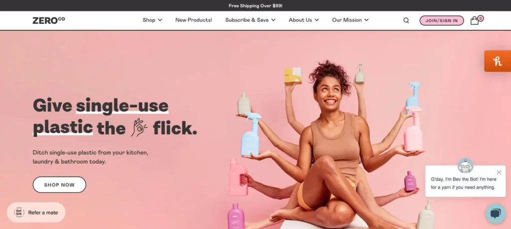
If you’re looking for inspiration for your home page, take a look at Zero Co. This Australian brand offers eco-friendly household cleaning products in reusable and refillable packaging. The website home page does an excellent job of communicating the brand’s unique value proposition.
One of the key elements of Zero Co’s home page is the brand’s clear and concise messaging. Their headline immediately communicates their commitment to sustainability, while their subheading reinforces their unique selling point of refillable and reusable packaging.
Zero Co’s home page also features high-quality visuals that help to reinforce its brand values and showcase its products. They use images of natural landscapes and eco-friendly packaging to communicate their commitment to sustainability, and their product images are clear and visually appealing.
In addition, Zero Co’s home page also includes educational content that helps to reinforce its brand values and educate customers about the environmental impact of traditional cleaning products. This content can help build trust with potential customers and position Zero Co as an eco-friendly household cleaning industry authority.

Strong Visuals: The Power of High-Quality Images
High-quality visuals are an essential component of a perfect home page. They grab visitors’ attention, create a lasting first impression, and help communicate your brand’s message in a way that words alone cannot.
One brand that does an excellent job of using high-quality visuals on its home page is Bite. Bite offers plastic-free and zero-waste tooth hygiene alternatives, and the home page features a variety of high-quality images that showcase products and reinforce the company’s commitment to sustainability.
The images on Bite’s home page are not only visually appealing, but they also serve a purpose in communicating the benefits of their products. For example, one image shows a glass container of toothpaste tablets, reinforcing the brand’s commitment to reducing plastic waste. Another photo shows their bamboo toothbrushes, communicating their focus on sustainability and reducing waste.

Easy Navigation: The Power of Clear and Simple Navigation
Clear, clutter-free navigation ensures visitors can easily find the information they’re looking for on your website. A cluttered and confusing navigation menu can quickly turn visitors away. A high-converting home page navigation is uncluttered and easy to use.
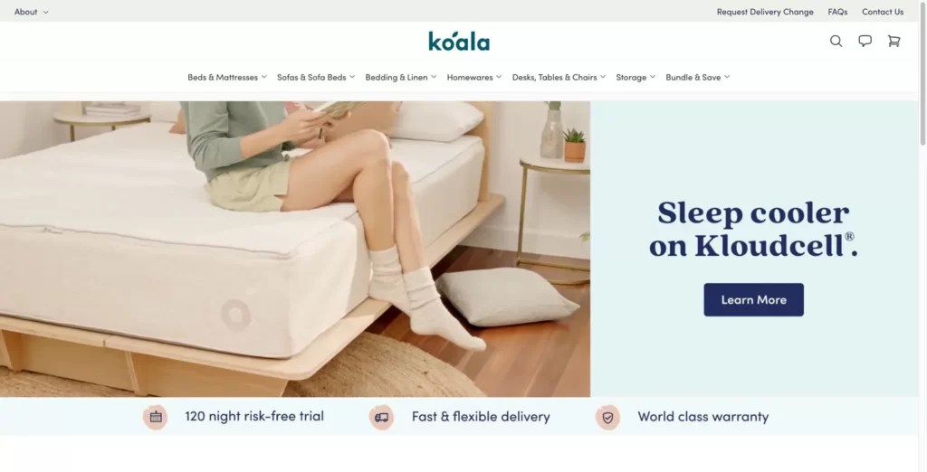
One brand that does an excellent job of using clear navigation on its home page is Koala, an Australian furniture company. Koala’s home page features a simple navigation menu at the top of the page that directs visitors to essential pages on their site, such as their products, about us, and FAQs pages.
What’s notable about Koala’s navigation menu is what it doesn’t include: social media links. While many brands include links to their social media profiles in their header or footer, Koala has kept their navigation menu simple and focused on the essentials. This helps to prevent clutter and ensures visitors can easily find the information they need without distractions.
In addition to its main navigation menu, Koala includes a search bar on their home page, allowing visitors to search for specific products or information quickly.

Calls to Action (CTAs)
CTAs are essential for encouraging visitors to take action, such as purchasing or signing up for a newsletter. Your home page should include clear, prominent CTAs relevant to your business goals.
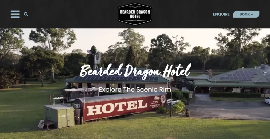
The Bearded Dragon’s website is an excellent example of using clear and prominent calls-to-action (CTAs) to encourage visitors to take action. The website strategically places CTAs such as “Book Now” and “Contact Us” throughout the site, making it easy for visitors to book a stay or make an enquiry. These CTAs are relevant to the hotel’s business goals of driving bookings and generating revenue.
In addition, the website’s CTAs are visually appealing and stand out from the surrounding content, thanks to bold fonts and contrasting colours. The CTAs are also strategically placed above the fold, meaning visitors don’t have to scroll down to find them, and they are repeated on various pages, such as rooms and restaurant pages.

See What Others Are Saying: The Power of Social Proof on Your Home Page
Including social proof on your home page is a great way to demonstrate your brand’s credibility and build trust with visitors. Consider including customer reviews, press coverage and awards relevant to your business to help establish your brand as a trusted and reputable choice.
By showcasing positive customer reviews, Sonder.com helps to establish trust with potential customers by showing that others have had positive experiences with their brand. Including press coverage further reinforces Sonder.com’s reputation as a trusted and reputable brand in the hospitality industry.
Your website’s home page is an essential element that can make or break your online presence. By following the principles discussed in this blog – having a clear and concise message, strong visuals, easy navigation, prominent CTAs, and social proof – you can create a high-converting home page that engages visitors and drives them towards your business goals. Remember to continually test and refine your home page to ensure it’s always performing at its best. With these tips, you’ll be on your way to a successful website that leaves a lasting impression on your audience.


